

The Small & Co Approach to Creative Furniture Painting
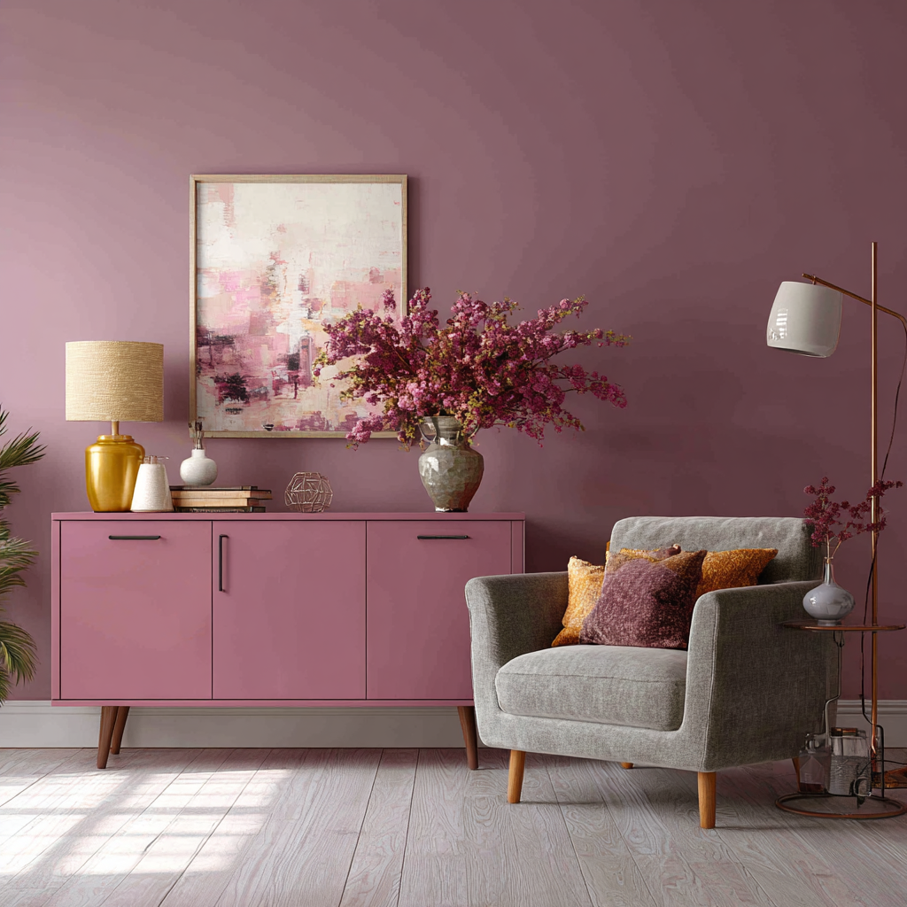
1) Colour Drenching: Tone-on-Tone Furniture Painting
If you’ve noticed interiors lately, you’ll know colour drenching is stealing the spotlight. It’s the idea of using one colour — or tonal variations of it — across an entire room, wrapping walls, skirting boards, ceilings, and furniture in a single cohesive palette. The effect is both dramatic and serene, giving your space that “pulled together” designer look without relying on busy patterns or lots of accent colours.
Why it works so well
Colour drenching simplifies a room, which makes it feel calmer, larger, and more intentional. Instead of your furniture feeling like an afterthought against the walls, it becomes part of the architecture. A painted wardrobe that melts into the wall behind it, or a desk that feels like an extension of the skirting, creates a seamless backdrop for the rest of your décor. It’s a brilliant way to:
- Highlight accessories: neutralise big furniture pieces so your art, textiles, or lighting stand out.
- Make small rooms feel bigger: fewer contrasts mean fewer visual “stops,” so the eye keeps moving.
- Create mood: cosy with deeper shades, airy with lighter tones.
Where to use it
- Bedrooms: Paint the wall, wardrobe, and bedside tables in one colour to create a restful, hotel-like atmosphere. Then layer in crisp bedding and warm lighting.
- Living rooms: Use it to disguise bulky items like a TV unit or bookcase so they blend into the room instead of dominating it.
- Studies or workspaces: A desk painted the same as the wall creates a subtle, professional feel — perfect for video calls or focused work zones.
How to achieve it
- Start with your wall colour and extend it to at least one key piece of furniture in the room.
- Keep detailing subtle — handles and trims can be slightly lighter or darker to add depth without breaking the effect.
- Don’t be afraid to go bold: a deep tone can feel sophisticated rather than overwhelming when used consistently.
Inspiring examples
- A snug living room painted entirely in a soft grey, with a sideboard and shelves in the same shade, becomes the perfect stage for artwork and plants.
- A small home office in muted teal, with the desk and shelves painted to match the walls, feels calm, cohesive, and far more expensive than it really was.
- A child’s bedroom in pale blush pink, with toy storage units painted to match, creates a soothing, playful environment that grows with them.
A final tip
Colour drenching doesn’t have to mean repainting every single thing in a room. Even picking out one or two large pieces of furniture to match your walls will instantly shift the mood. It’s a simple, achievable furniture painting technique that makes your space look curated, considered, and ready for the pages of a magazine.
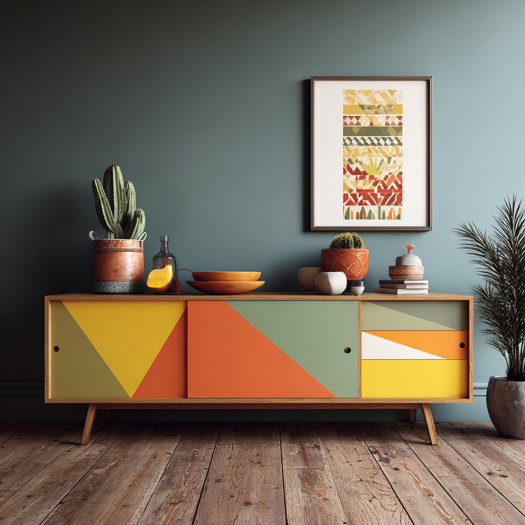
2) Colour Blocking: Bold Geometric Furniture Painting
If colour drenching is all about subtlety, colour blocking is its confident, playful cousin. This furniture painting technique uses bold, contrasting sections of colour to turn an ordinary piece into a graphic statement. Think clean stripes across a wardrobe door, bold panels on a sideboard, or even multi-coloured drawer fronts that feel fresh and modern.
Why it works
Colour blocking brings energy and creativity into a space. It’s perfect if you want your furniture to stand out rather than blend in. Because it’s geometric and structured, it feels intentional — not messy — even when you use bright or unexpected colour combinations.
- Adds personality: Your furniture becomes a piece of art, not just storage.
- Modern yet versatile: Works in both contemporary flats and eclectic period homes.
- Budget-friendly update: Instead of buying new, you can totally reinvent old furniture with just tape and paint.
Where to use it
- Wardrobes & armoires: Paint each door panel in a different tone for maximum impact.
- Sideboards & media units: Try bold vertical or diagonal stripes for a mid-century modern vibe.
- Children’s furniture: A fun way to introduce playfulness without overloading the room with cluttered décor.
How to achieve it
- Map out your design using painter’s masking tape for crisp, clean edges.
- Stick to 2–3 colours for cohesion — more can feel overwhelming.
- Choose a base colour and then add blocks in complementary shades.
- Keep coats thin and even to avoid ridges when peeling off the tape.
Inspiring ideas
- A plain pine chest of drawers becomes striking with one half painted in Royal Navy and the other in Windsor Swan for a bold, nautical feel.
- A retro-style sideboard painted with alternating panels of Brighton Breeze, Suffolk Shell, and Mersey Mist creates a playful yet calming mid-century look.
- A desk with diagonal blocks in Camden Bookcloth and Iron Bridge instantly looks like a sleek, high-end design piece.
👉 If you’re craving a DIY painted furniture idea that feels brave but achievable, colour blocking is a fantastic way to inject creativity into your home without needing any artistic skills — just patience, tape, and a steady hand.
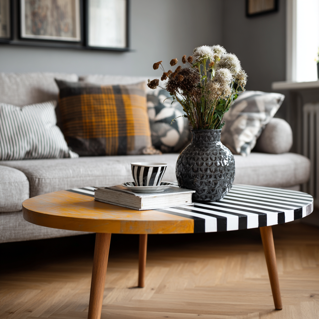
3) Checkerboard & Stripes: Pattern Play with Paint
One of the simplest ways to make furniture feel fun and eye-catching is with checkerboard and stripe patterns. These designs are timeless — think Georgian floors, Art Deco textiles, or classic seaside deckchairs — yet right now they’re also bang on trend in interior design. A painted checkerboard or stripe adds instant personality and works just as well in modern flats as it does in country cottages.
Why it works
Patterns like checks and stripes are graphic but familiar, so they never feel “too much.” They create rhythm, movement, and visual interest, and they’re a clever way to disguise uneven surfaces or revive flat-front furniture.
- Versatile style: Checkerboards feel playful in bright colours, but chic and sophisticated in neutrals.
- Scalable: Works on small details (drawer sides) or as a bold all-over design.
- Budget-friendly: Achieve a high-end designer look with just tape, patience, and two colours of paint.
Where to use it
- Tabletops & coffee tables: A checkerboard top can completely change a simple piece.
- Drawer sides & interiors: A hidden stripe or check inside makes opening a drawer a delight.
- Cabinet bases & kickboards: A patterned strip along the bottom adds a subtle, playful detail.
How to achieve it
- For stripes, mask parallel lines using quality painter’s tape.
- For checkerboards, draw a grid with a ruler, then mask alternating squares.
- Apply thin coats for clean edges — and peel the tape while the paint is still slightly tacky to avoid tearing.
Inspiring ideas
- A wooden coffee table transformed with a Brighton Breeze and Windsor Swan checkerboard top — coastal, fresh, and perfect for a living room with rattan accents.
- A chest of drawers with crisp vertical stripes in English Mustard and Pembroke Pewter — bold but balanced, with a touch of heritage charm.
- A kitchen stool finished with a Camden Bookcloth and London Fog checkerboard seat for a subtle nod to Georgian tiled floors.
👉 If you’re after a painted furniture idea that feels both classic and contemporary, checkerboards and stripes are a brilliant choice. They’ll give your furniture a new lease of life while adding a playful pattern that ties beautifully into wider interior trends.
4) Limewash & Roman-Clay Look: Soft, Textured Furniture Painting
If you’ve noticed interiors leaning towards calm, earthy textures, you’ve probably spotted the limewash and Roman-clay effect. Traditionally seen on walls, this soft, chalky finish is now being recreated on furniture to give ordinary pieces a tactile, hand-crafted feel. It’s less about perfection and more about depth, movement, and natural beauty.
Why it works
This technique mimics the patina of plaster or stone, instantly adding history and character to a piece of furniture. Instead of a flat block of colour, you get subtle variation, texture, and warmth.
- Adds depth: Perfect for pieces that might otherwise feel plain.
- Classic feel: Echoes traditional European finishes with a modern twist.
- Unique every time: No two pieces ever turn out the same, which makes it perfect for upcycling.
Where to use it
- Console tables or sideboards: Adds a tactile, artful presence in a hallway or living room.
- Bedside tables: A soft limewashed finish creates a calm, restful mood in bedrooms.
- Accent cabinets: Great for giving small furniture a sculptural, statement quality.
How to achieve it
- Choose two similar shades — one slightly darker, one slightly lighter.
- Apply the first coat as your base, then use a wide, natural bristle brush to cross-hatch the second shade on top in loose, sweeping strokes.
- Dry-brush areas with very little paint to create movement and variation.
- Optional: Use a damp cloth or sponge to soften transitions for a plaster-like effect.
Inspiring ideas
- A hall console painted in Cotswold Cobbles with lighter highlights in Mersey Mist for a weathered-stone effect that looks like it’s been there forever.
- A pair of bedside tables finished in Wren’s Nest with brushed layers of London Fog, creating a soft, chalky finish that makes a bedroom feel serene.
- An accent cabinet in Hadrian’s Moss layered with touches of Highland Haze, bringing a natural, woodland-inspired texture indoors.
👉 If you’re drawn to furniture painting techniques that feel organic and full of character, the limewash or Roman-clay look is a stunning option. It’s an achievable way to give your furniture the same soft, textured beauty you see in high-end interiors.
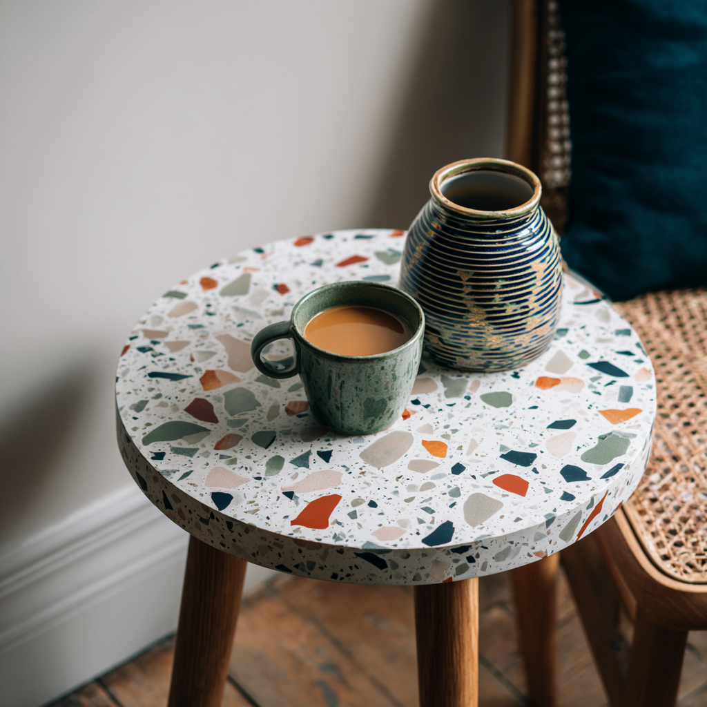
5) Terrazzo Speckle Top: Playful Yet Polished
Terrazzo — that classic Italian composite of stone chips in concrete — has made a big comeback in interiors. While real terrazzo is pricey and heavy, the terrazzo speckle effect can be recreated with paint for a playful, modern finish on furniture. It’s a brilliant way to add colour and personality without overpowering your space.
Why it works
The terrazzo effect is colourful and fun, but also neat and sophisticated. It gives a nod to craftsmanship and design history while still feeling contemporary.
- Playful but grown-up: Adds cheerfulness without being childish.
- Customisable: You choose the colours and scale of the speckles.
- Durable: Works best on tabletops, trays, and shelves where you want impact.
Where to use it
- Side tables & coffee tables: A terrazzo top turns a simple piece into a statement.
- Plant stands: A great way to add a pop of colour to greenery displays.
- Kids’ desks: Fun and inspiring without being over the top.
How to achieve it
- Paint your base coat in a neutral (white, pale grey, or soft beige works best).
- Use a small piece of sponge, an old brush, or even a cotton bud to dab “chips” of paint in 3–4 colours.
- Vary the size and spacing of the speckles to mimic real terrazzo.
- Once dry, seal with a clear protective topcoat, especially for table surfaces.
Inspiring ideas
- A round side table with a Windsor Swan base and speckles in Bedford Bramble, Brighton Breeze, and Hadrian’s Moss — fun, modern, and fresh.
- A children’s desk with a pale Suffolk Shell base, dotted with cheerful flecks of English Mustard, Beacon Blue, and Camden Bookcloth.
- A set of coasters or trays painted in London Fog with speckles of Royal Navy and Iron Bridge for a grown-up, monochrome terrazzo look.
👉 If you’re looking for a DIY painted furniture idea that feels artistic but achievable, terrazzo is the one. It’s forgiving, fun, and endlessly customisable — no two pieces will ever look the same.
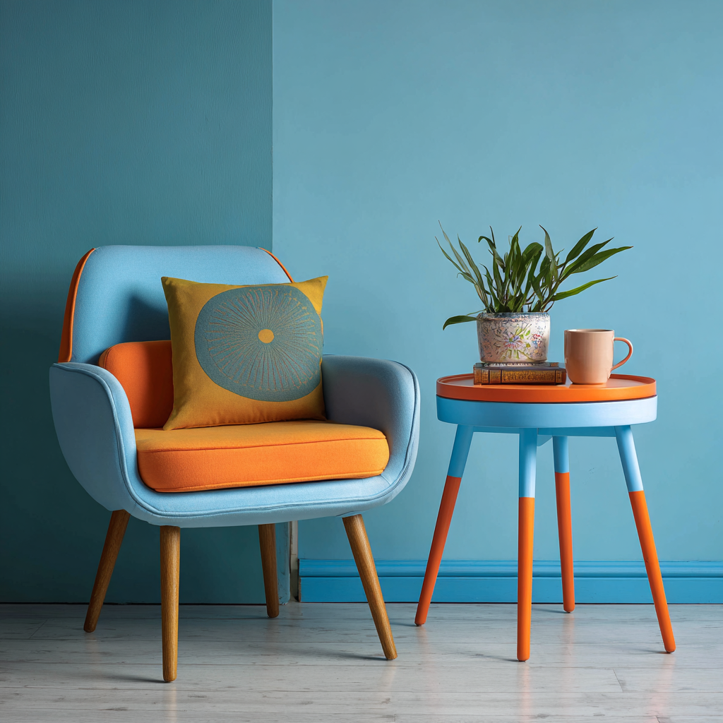
6) Dipped Legs & Edges: Crisp Contrast
One of the most effective ways to give your furniture a fresh, modern twist is with the dipped paint effect. Imagine chair legs, table edges, or stool feet looking as though they’ve been dipped straight into a pot of colour. It’s simple, stylish, and a great way to add contrast without overwhelming the whole piece.
Why it works
The dipped effect feels playful and contemporary while still being understated. It nods to the minimal, Japandi-inspired trend but works in classic homes too.
- Adds contrast: Breaks up larger pieces with a pop of colour or a bold stripe.
- Quick update: You don’t need to repaint the whole piece to make it feel new.
- Versatile style: Works with neutrals for a subtle look, or with bold shades for a statement.
Where to use it
- Dining chairs & stools: Perfect for painting just the bottom 10 cm of each leg in a contrasting shade.
- Coffee tables: Paint the lower edge or just the legs for an eye-catching finish.
- Bedside tables: A dipped drawer front or base adds a playful, unexpected detail.
How to achieve it
- Decide how much of the leg or edge you want “dipped” (5–10 cm usually works best).
- Use painter’s tape to mask a clean, straight line all the way around.
- Apply thin coats of paint below the tape line, and peel the tape while the paint is still tacky for the crispest edge.
Inspiring ideas
- A set of oak dining chairs with natural wood tops and legs dipped in Royal Navy — bold, modern, and perfect for a kitchen-diner.
- A side table painted in Wren’s Nest, with the bottom edges dipped in English Mustard for a playful pop of colour.
- A rustic bench finished in Cotswold Cobbles, with legs “dipped” in Camden Bookcloth, bringing a touch of contemporary edge to a farmhouse classic.
👉 If you’re after a modern furniture painting idea that’s quick, fun, and beginner-friendly, dipped legs and edges are a fantastic place to start. It’s a simple detail that makes furniture look bespoke and design-led with very little effort.
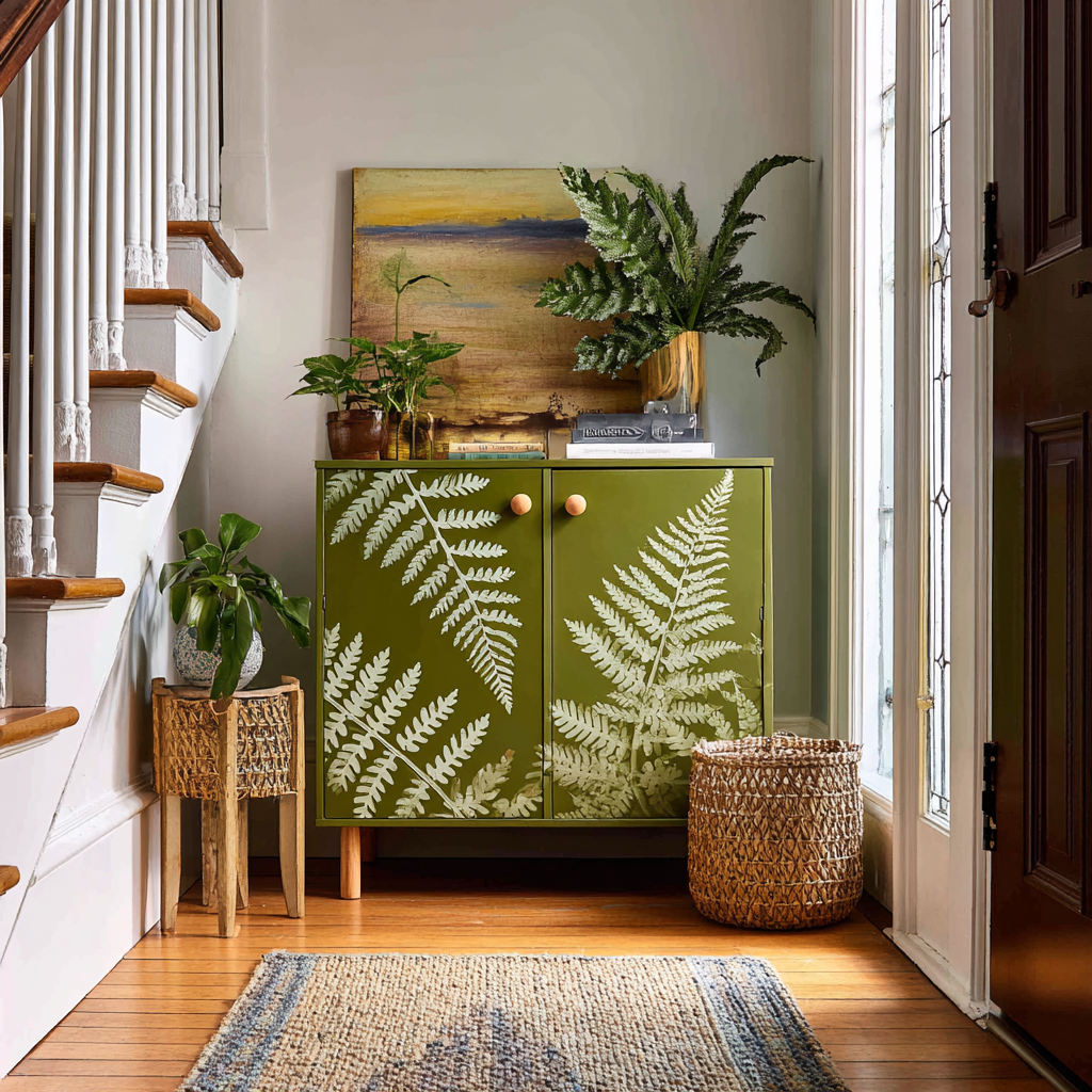
7) Botanical & Nature Motifs: Hand-Painted or Stencilled
Sometimes it’s the little details that make the biggest impact. Adding botanical or nature-inspired motifs to furniture is a beautiful way to bring the outdoors in and give a piece its own character. Think trailing leaves, Art Nouveau curves, or delicate florals creeping across a wardrobe door. It’s a timeless idea, and with stencils, it’s also incredibly achievable.
Why it works
Nature-inspired patterns never date. They soften hard furniture lines, add movement, and create a calming, organic feel in any room.
- Adds artistry: Your furniture becomes a canvas, not just a storage piece.
- Scalable: Go subtle with a leafy drawer front, or bold with a stencilled wardrobe.
- Classic appeal: Works with everything from boho chic to heritage interiors.
Where to use it
- Wardrobes & armoires: A leafy stencil on the doors adds instant charm.
- Hall cupboards or shoe storage: A chance to make a utility piece beautiful.
- Nursery furniture: Soft botanical motifs add calm, playful detail.
How to achieve it
- Choose your stencil design (our Botanical Collection includes ferns, fronds, and florals; our Art Deco range offers bold curves; and the Georgian tile patterns are perfect for a heritage feel).
- Paint your base colour, allow it to dry, then secure the stencil with low-tack tape.
- Use a stencil brush or sponge with very little paint to dab colour through the design.
- For a softer look, try layering two close shades for depth.
Inspiring ideas
- A nursery chest of drawers in Windsor Swan, decorated with soft fern stencils in Hadrian’s Moss for a gentle, nature-inspired feel.
- A hallway cupboard in London Fog, finished with bold geometric leaves from the Art Deco stencil range in Iron Bridge — elegant and dramatic.
- A wardrobe painted in Brighton Breeze, with repeating Georgian tile motifs in Pembroke Pewter for a heritage-meets-modern look.
👉 If you want a furniture painting technique that combines creativity with accessibility, stencilling is unbeatable. It’s quick, forgiving, and lets you add unique, detailed motifs without needing to be a professional artist.
View our stencil collection.
8) Faux Linen / Strié Effect: Textile Texture with Paint
If you love the soft, tactile look of woven fabric, you can recreate it on furniture with the strié or faux linen paint effect. It’s a clever technique that adds subtle texture and depth to otherwise plain surfaces, making your furniture look custom and high-end.
Why it works
The faux linen finish mimics the cross-hatch texture of fabric. It’s understated, so it doesn’t overwhelm a room, but it adds a touch of elegance that makes furniture feel unique and bespoke.
- Subtle depth: Adds visual interest without bold patterns.
- Versatile: Works in both modern minimalist homes and traditional settings.
- Designer look: Gives the impression of an upholstered or fabric-inlaid panel at a fraction of the cost.
Where to use it
- Drawer fronts: A chest of drawers instantly feels more refined with a textured look.
- Cabinet insets: Great for breaking up flat wardrobe or cupboard doors.
- Desks & dressing tables: Adds a tactile quality to working or vanity surfaces.
How to achieve it
- Paint a solid base coat and allow it to dry fully.
- Dip a dry brush into a lighter (or darker) shade and remove most of the paint on a rag.
- Drag the brush in long, straight strokes across the surface, working with the grain of the wood.
- For a linen effect, repeat with a second set of strokes at right angles to create a woven look.
- Keep your hand light — less pressure makes for a more natural, fabric-like effect.
Inspiring ideas
- A chest of drawers base-painted in Mersey Mist, with soft strié strokes in Pembroke Pewter to mimic the look of brushed linen.
- A dressing table in Brighton Breeze, with cross-hatched highlights in Mayfair Morning for a fresh, coastal-inspired finish.
- Wardrobe panels painted in Wren’s Nest, with strié detail in London Fog, giving a muted, textile effect perfect for a calm bedroom.
👉 If you want a furniture painting technique that feels subtle, sophisticated, and different from a flat finish, the faux linen or strié effect is a brilliant option. It’s easy to try, endlessly customisable, and guaranteed to elevate even the simplest piece.
9) Slim Inlay Borders: Faux Marquetry with Paint
Sometimes the smallest details create the biggest impact. Adding a painted inlay border is a clever way to give furniture a refined, tailored look, almost like fine marquetry or decorative joinery — without needing woodworking tools. It’s a subtle touch that instantly makes a piece feel more expensive and bespoke.
Why it works:
A slim border frames surfaces beautifully and draws the eye to the craftsmanship of the piece. It works especially well on furniture with flat panels or broad tops where the design can really shine.
- Elegant detail: Creates the illusion of inlaid wood or decorative trim.
- Heritage-inspired: Nods to antique furniture without the price tag.
- Customisable: Works with subtle tone-on-tone shades or bold contrasts.
Where to use it:
- Chest tops & side tables: Painted pinstripes around the edge add instant elegance.
- Bureau lids or writing desks: Perfect for highlighting the working surface.
- Wardrobe or cupboard doors: Frame the panels for a Georgian or Art Deco feel.
How to achieve it:
- Paint your base coat and let it dry fully.
- Use painter’s tape to mask a slim line (5–10 mm) around the edge or panel.
- Paint the exposed strip in your chosen border colour, keeping coats thin and crisp.
- For extra finesse, add a second inner line for a “double inlay” look.
Inspiring ideas:
- A writing desk in London Fog, framed with a fine Iron Bridge border for a subtle, heritage feel.
- A bedside table painted in Windsor Swan, with slim Royal Navy inlay lines for a crisp, nautical-inspired finish.
- A wardrobe in Highland Haze, edged with delicate Bedford Bramble borders to add warmth and sophistication.
👉 If you’re after a painted furniture idea that feels classy but is still beginner-friendly, inlay borders are a brilliant option. They’re simple to achieve with tape, but the effect is timeless, tailored, and full of charm.
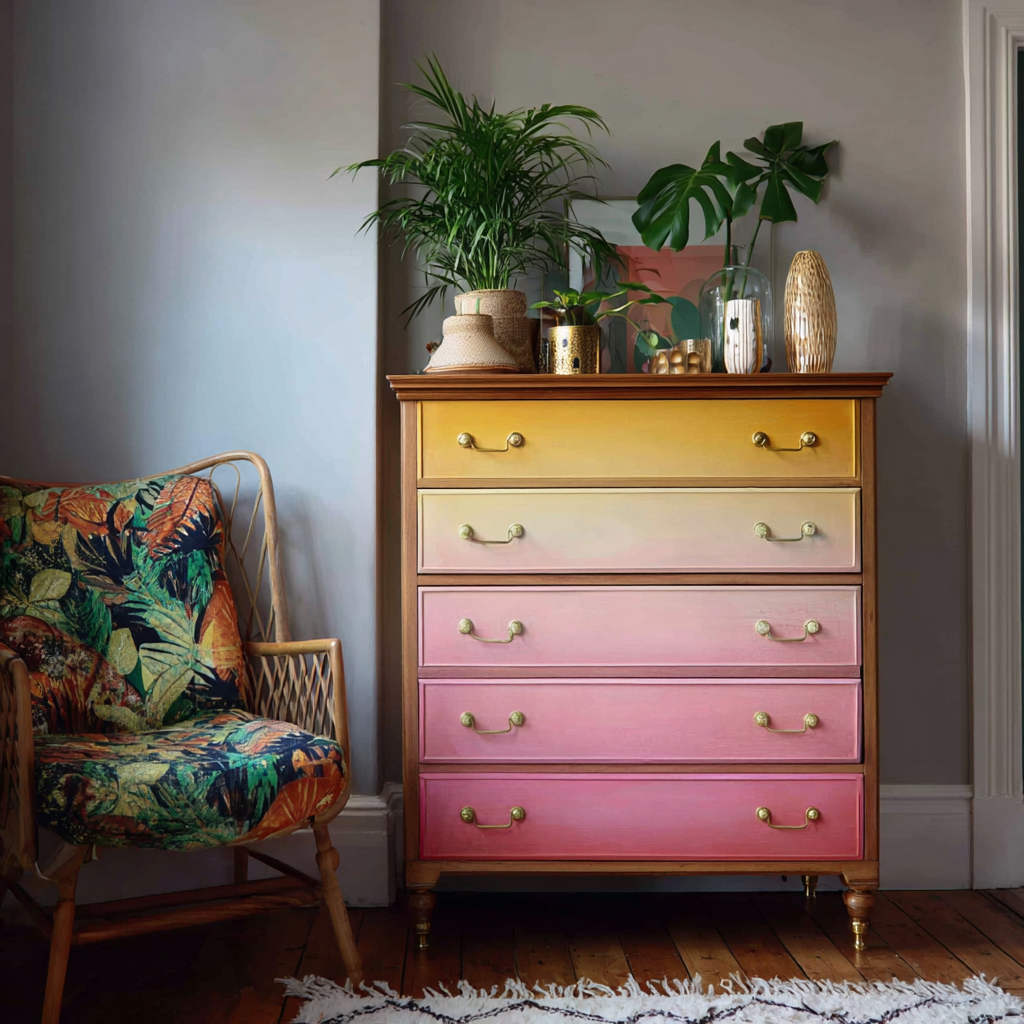
10) Two-Tone Ombré: Soft Gradient Colour
Few furniture painting techniques make as much impact as a two-tone ombré. This is where one colour gradually blends into another, creating a soft, seamless gradient that looks artistic yet calming. It’s a finish that immediately feels bespoke and high-end, but with a little practice, it’s surprisingly achievable at home.
Why it works
Ombré painting creates depth and movement, breaking up flat surfaces with a flowing transition of colour. It works with bold contrasts for drama, or with subtle shades for a gentle, atmospheric effect.
- Adds drama or calm: Use bold pairings for impact, or tonal blends for serenity.
- Unique finish: No two ombré pieces ever look the same.
- Statement-making: Transforms big furniture into a focal point.
Where to use it
- Wardrobes & tall cabinets: Perfect for vertical blends from dark to light.
- Headboards: Creates a calming, dreamy effect behind the bed.
- Bookshelves or hutches: Blend inside panels for a surprise wash of colour.
How to achieve it
- Choose two shades (either contrasting or tonal).
- Paint the top section with your lighter colour, the bottom with your darker shade.
- While the paint is still workable, use a clean, slightly damp brush to feather the line where the colours meet, blending them together.
- Work in thin layers, and repeat until you’re happy with the gradient.
Inspiring ideas
- A tall wardrobe blending from Brighton Breeze at the top into Mayfair Morning at the base for a soft, coastal-inspired finish.
- A headboard shifting from Hadrian’s Moss into Dartmoor Deep, echoing woodland shadows and adding depth to a bedroom.
- A bookcase interior painted from Suffolk Shell into Bedford Bramble, creating a romantic ombré backdrop for books and treasures.
👉 If you want a DIY furniture painting idea that looks creative, artistic, and one-of-a-kind, ombré is the showstopper. It takes patience and practice, but the results are worth every brushstroke.